
As a scientist, interacting with data allows you to gain new insight into the phenomena you’re studying. If you read the New York Times, the D3 docs or you browse distill, you’ll see impressive browser-based visualizations – interactive storytelling that not only accurately represent data but bring your attention to surprising aspects of it. Making good visualizations of your work can increase the accessibility of your research to a wide audience. My favorite example here (already several years old) is the semantic map of the brain from James Gao, Alex Huth, Jack Gallant and crew – at the time, visualizing brain map data in the browser was unheard of, and here was a visualization of how the processes meaning in movies and podcasts, in the browser, no downloads necessary.

Coming from the Python world, most visualizations you’ll make on a day-to-day basis will be very different from these: static plots, because that’s what’s convenient to make in matplotlib. How can you go from the Python world of static plots to the wizardry of Javascript?
A big wall you’ll run into is that modern web development is big. Getting to proficiency is hard: it’s very easy to get discouraged and fall off the wagon before you get to build something interesting. What I’ve assembled here is a kind of roadmap so that you can start building interesting dynamic visualizations with the lowest barrier to entry as possible, while building a self-reinforcing skillset.
| Technology | Application areas | Pros | Cons | What you learn |
|---|---|---|---|---|
| Python-based generators | Dashboards, lightweight interactions | Easy distribution, low barrier to entry | Limited customization | Grammar of interactive graphics |
| Jupyter notebook | Daily data exploration | You’re already using it! | Distribution not straightforward | Snippets of HTML, JS, SVG |
| Walled garden | All-in-one visualizations (widgets) | Limited things to learn | What you learn is non-transferable | The walled garden |
| JS notebooks | Literate programs | REPL environment, good docs | Learning curve a bit steep | Core JS plus visualization libraries |
| Python in the browser | Science | You already know it | Big libraries, slow | Interact with canvas, svg, etc. |
| The web | Web dataviz | You control everything | Floodgates of tech stack, learning curve quite steep | Packaging, components, deployment |
Finally, at the end of this article, I cover JS libraries you might want to learn to do for plotting or numeric work. I’ve built this from experience over the last year experimenting with about a half-dozen interactive visualization methods; of course, if you know better curricula, books or tutorials, please let me know in the comments.
Subscribe to xcorr and be the first to know when there’s a new post
Step 0: Python-based libraries
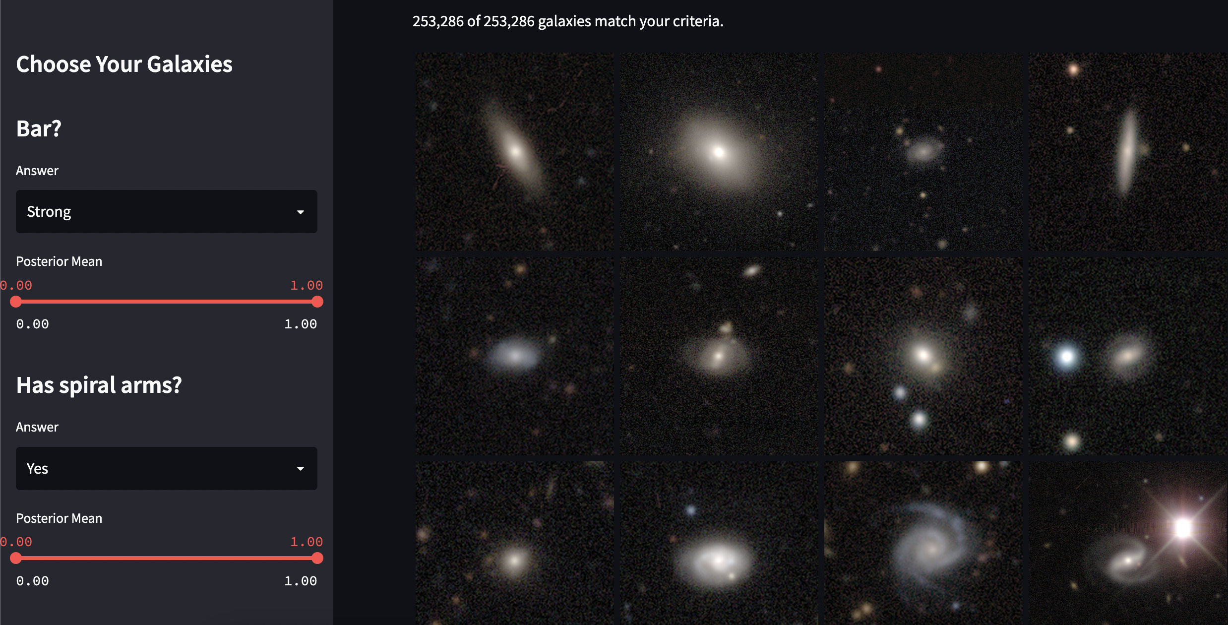
Your first option is to not code for the web at all by leveraging pure Python-based libraries. Many libraries aim to fill a niche for everyday interactive graphics, which include lightweight interactions – hover interactions, tooltips, interactive legends, etc. This includes Plotly, Bokeh w/Holoviews and Altair w/vegalite. For interactives maps, ipyleaflet is worth mentioning.
Dashboard tools
There has been an explosive growth in dashboards in the past few years. These solutions fill the same niche as the ubiquitous Shiny fills in the R ecosystem: a way for data science teams to create dashboards. A dashboard will typically consist of:
- A frontend with:
- form elements, sliders, text inputs, etc. to drill down into a dataset
- visualizations, plots, charts, etc. including those using standard Python libraries or HTML/CSS/JS
- A backend that does data processing, spits out charts, does remote calls, etc.
- Some solution to deploy frontend and backend
Most often, dashboards will come with a command line tool that starts a local server to test your visualizations locally. To share your visualizations, you’ll need a server. All solutions have a basic open source offering allowing you to DIY deploy such a server yourself via e.g. a cloud provider. You can instead opt for a managed cloud solution. Here they are:
| Product | Deployment | Peculiarities | Associated plotting library |
|---|---|---|---|
| Streamlit | DIY, commercial, HuggingFace spaces | Easy programming model | Agnostic |
| Dash | DIY, commercial | Supports lots of customization, aimed at enterprise users | Plotly, with support for other libraries |
| Gradio | DIY, commercial, HuggingFace spaces | Specialized for ML showcase with specialized quality-of-life features | Agnostic |
| Panel | DIY | Works inside of jupyter and standalone | Bokeh, with support for other charting libraries |
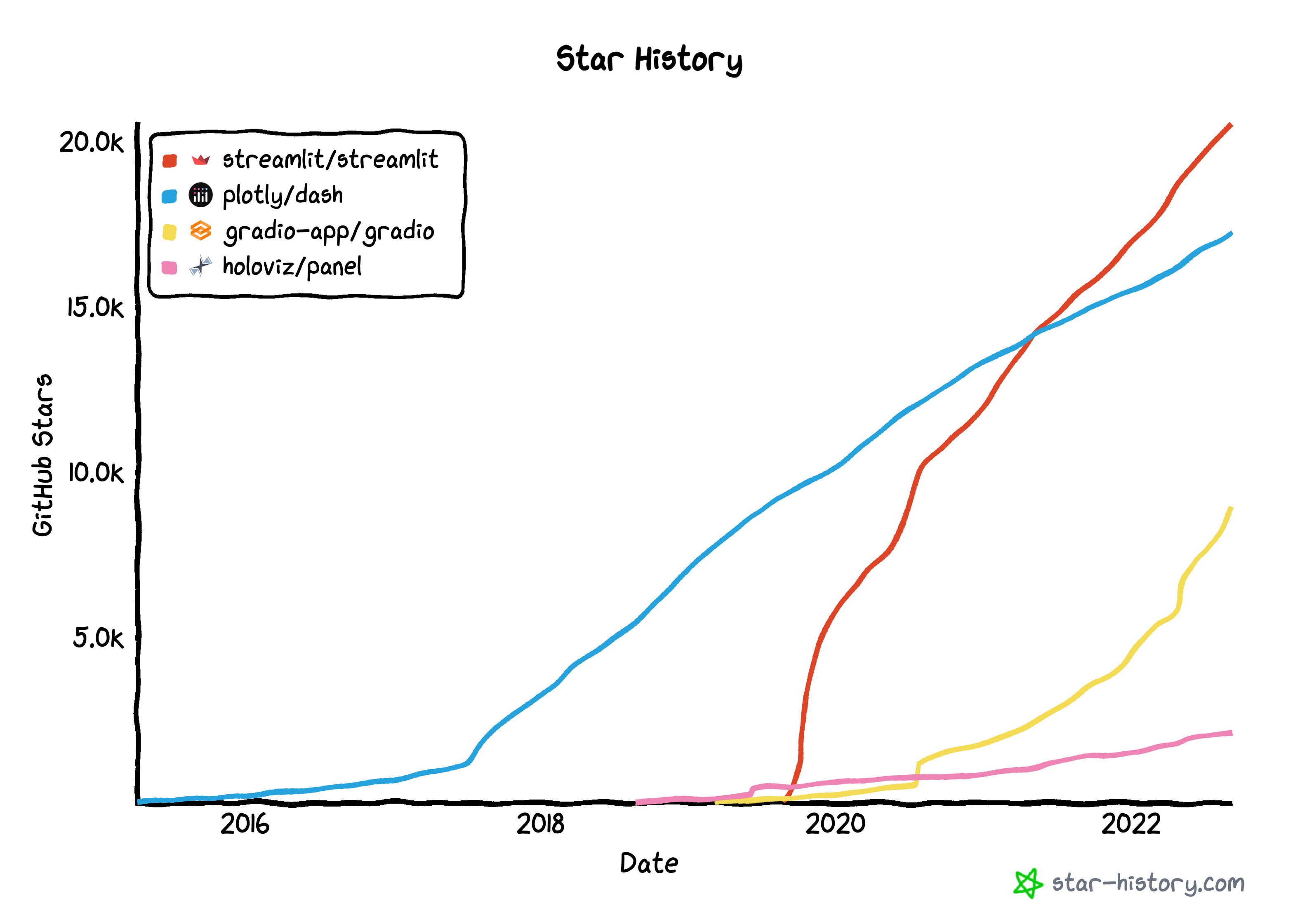
Of these, Streamlit has the most momentum according to Github stars, although gradio is growing the fastest. One big element behind streamlit and gradio’s growth is their support in HuggingFace spaces, which allows demos of machine learning projects to be quickly built and deployed. Craiyon and Stable Diffusion, which both generate images based on natural languages prompts, are two examples of projects hosted or formerly hosted on HuggingFace spaces and coded in gradio.
streamlit is the solution I’ve used the most and it really does fit the bill for a lot of lightly interactive visualizations. What’s most interesting is that the programming model doesn’t rely on callbacks to update the visualization when you change form values. Instead, you write normal code, and it figures out when something needs to be refreshed based off of a DAG of dependencies it builds. You can then cache to your heart’s content. It’s quite clever and it creates pretty clean code that’s easy to reason about.
Step 1: build for jupyter notebook
Perhaps the lowest friction way of doing dynamic HTML-based visualization in Python is in the jupyter notebook environment (or jupyter lab or colab). After all, you’re writing Python inside the browser right now, why not use the same environment to whip up a quick interactive visualization? A big advantage of this type of solution is that it minimizes the contortions you have to go through to translate Python data types to javascript. And because you’re writing HTML, JS and Python side-by-side, your iteration cycles are very fast. The biggest problem is that most widgets you will create here will not display correctly when you publish them to the web, e.g. on GitHub: people will have to download the notebook to get the interactive effect. They will work inside of Binder, however. They are a great way to dip your toe into this world – at this point, you can probably get by by copying and pasting snippets of HTML, CSS, SVG and Javascript.
_repr_html_ and IPython.core.display
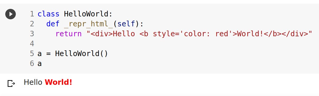
When you print a variable at the end of a Jupyter cell, how does Jupyter know how to display it? The answer is that it looks for a _repr_html_ method for the associated class and calls it. This function can return any arbitrary snippet of HTML, including an iframe which does interactive things, or a snippet which embeds javascript. See this colab for examples on how to do this. You can do fairly sophisticated things with this simple method, for instance building an interactive widget for pandas.
You may also trigger a rich display from anywhere inside a cell, not just at the end, using the ipython API. Again, you can include any number of web technologies, including embedding scripts inside the embedded HTML.
from IPython.core.display import display, HTML
display(HTML('<h1>Hello, world!</h1>'))
ipywidgets and interact
ipywidgets, also known as jupyter-widgets or simply widgets, are interactive HTML widgets for Jupyter notebooks and the IPython kernel. Notebooks come alive when interactive widgets are used. Users gain control of their data and can visualize changes in the data. Learning becomes an immersive, fun experience. Researchers can easily see how changing inputs to a model impact the results.
The ipywidget manual
Next in line in complexity are ipywidgets. Like IPython.core.display, ipywidgets can display rich HTML; however, widgets can also have events which cause them to call Python. See this notebook for an example. You can use them, for instance, to navigate through a plot with widgets. In fact, this pattern is so common that there’s a convenience function called interact which allows you to do just slider-based interactions.
voila
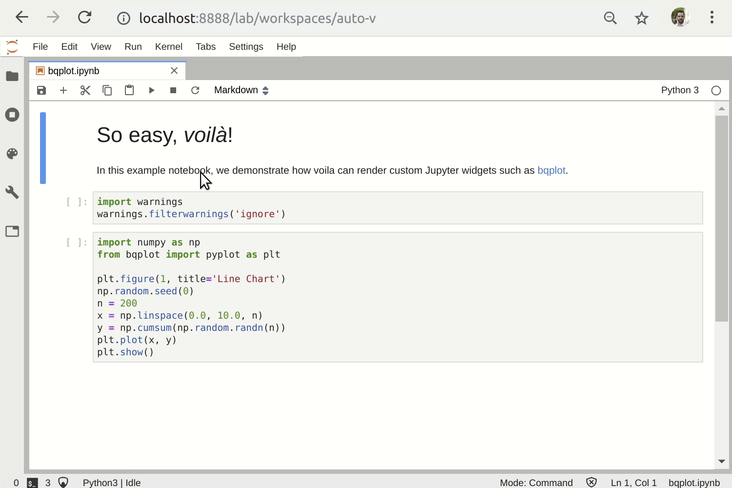
Building on jupyter widgets, you can release fully fledged dashboards based in jupyter notebooks. This is called voila. The idea is that you write a regular jupyter notebook, and then you can serve it through a tornado server on the web. The end user sees a dashboard which is the concatenation of the output cells of the dashboard, without the code. You can deploy this on Heroku or Google App Engine to make your application world accessible.
Step 2: Walled gardens
At this point, you might feel stifled by the limited interactivity afforded by the solutions offered so far. And you might feel intimidated by full-fledged modern web development. Many products exist to fill the gap. However, I argue here that it’s better to bite the bullet and skip straight ahead to writing real javascript in a notebook environment, because you will continue building on core skill sets around web technology. Nevertheless, I mention these options here for completeness and because they may satisfy your particular use case.
Unity
Unity is a game development engine and IDE. It’s a great environment to build offline games and VR visualizations. It transpiles exported scenes and C#-based scripting to WebAssembly (WASM), so it also runs in the browser. C# is a modern language with operator overloading. 2d and 3d interaction are easily accommodated. Cons: widgets (sliders, input boxes, etc.) must be created in the Unity interface and are non-native. The Unity applet acts as a walled garden, making it difficult to interact with the native DOM. The C# code cannot be compiled with a command line tool – it must be combined with the project and compiled in the Unity editor, and the project is several GBs, hence can’t be tracked in Github. Furthermore, the math libraries in C# are pretty limited. Overall, a pretty limited option for the web, though it has considerable appeal if you’re doing 3d viz.
p5.js and openprocessing
OpenProcessing sketch, Self-organized critical model
p5.js and openprocessing bring processing – a creative coding platform – to javascript. You write sketches, with an init function and a loop function, which define how the sketch works. You draw into the sketch with functions that allow you to draw lines, rectangles, sprites, polygons, etc. The appeal of processing is that you’re learning creative coding and there are very little barriers to entry. The biggest con is that while you learn a little bit of javascript in the environments, you really don’t learn modern web technologies. At the end of the day, you’ll know how to draw into your sketch, but you won’t know about canvas, svg, css, etc. – and you’ll be limited in the libraries that you can import into that environment. That being said, they can be part of your toolkit, especially p5.js which can interop with plain JS.
Step 3: Javascript notebooks
The next step in complexity is Javascript-based notebooks. Just as there are Python-based notebook environments that use remote kernels (jupyter, colab), there are local notebook-based environments that use Javascript that runs locally in the browser. That means you get the full power of the web – html, canvas, css, svg, javascript with remote libraries, etc. – but you’re doing it in an environment on wheels which supports the familiar REPL workflow of jupyter notebooks. These are environments which are ideal for literate programming which mixes text, math, code and visualization.
For many, I suspect this will be the right level of complexity. In practice, using notebooks mean you will need to export your data out of Python in order to visualize it – for many use cases, json will do the trick. You can export a dataset from pandas using the to_json method, or use the json library to export arbitrary dicts and lists.
Observable
Observable is a notebook environment that runs in the browser, created by Mike Bostock, creator of d3. Observable is a little like a jupyter notebook, but it uses a kind of functional style where each cell may only have one output, and it resolves the DAG of dependencies to figure out which cells to recompute at what time, thus avoiding the pitfalls of ipython out-of-order execution issues. It has an excellent set of starter tutorials. The observable runtime is open-source, but the notebook environment is closed-source. It continues to be feverishly developed – they just added multi-user collaboration. Strictly speaking, it does not use Javascript, and it doesn’t make it very easy to export strict JS out of it – however, you can embed single cells on a webpage. Overall, a great place to get your REPL workflow going.
Starboard

Starboard is an open-source interactive notebook environment. It uses a different programming model than Observable, sticking much closer to the Jupyter model with its advantages and disadvantages. It’s a bit niche, but I wanted to mention it because it has support for both javascript and python via Pyodide. What’s that you say? Python in the browser? This deserves a longer explanation.
Step 4: Python in the browser
You can code in Python directly in the browser with Pyodide. What? How? Because we live in the future, that’s why:
“Pyodide brings the Python 3.8 runtime to the browser via WebAssembly, along with the Python scientific stack including NumPy, Pandas, Matplotlib, SciPy, and scikit-learn. The packages directory lists over 75 packages which are currently available. In addition it’s possible to install pure Python wheels from PyPi. Pyodide provides transparent conversion of objects between Javascript and Python. When used inside a browser, Python has full access to the Web APIs.”
Pyodide docs
That means you can keep some of the numerical computation in Python and mix and match JS and Python as necessary – though you’ll probably still want to use Javascript to manipulate the DOM. Pyodide was originally spun out by Mozilla from a JS notebook project and kind of lingered for while, but it looks like it’s picking up steam with the announcement of PyScript. Pyscript makes using Pyodide slightly easier, and more importantly is supported by Anaconda. You can do mind-blowing stuff with Pyscript, like calculating a Mandelbrot fractal in Python and displaying it directly using canvas:
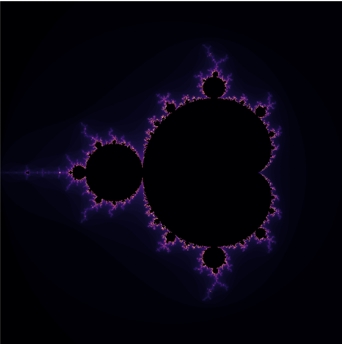
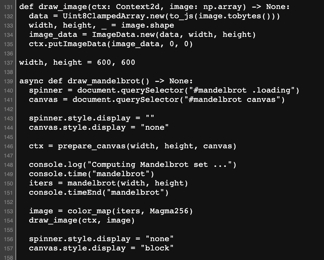
Why would you bother doing anything else? Well, the price to pay here is that the libraries are heavy; that demo downloads 15MB of stuff, including wheels for numpy and sympy. And to be effective, you’ll need to learn a little bit of HTML and JS and CSS.
Step 5: the web
Now you’ve had a chance to learn javascript, html, svg, enough css to do the job in the context of dynamic visualizations, and now you’re ready to tackle the world – the world wide web! It’s tempting at this point to learn modern web development, with its complex toolchains (npm + react + webpack + …) . I had an interesting conversation with Chris Olah recently who mentioned that when it comes to doing visualizations, the core skillsets – html, the dom, css, svg, etc. – are more important than learning any particular framework, and it helped organize this article. If you do need a component framework to work within a larger page, a more lightweight framework, like Svelte or vue.js, might satisfy your needs.
One very annoying gotcha you’ll run into is packaging differences between node and JS built for the web. A lot of packages you’ll use for data analysis in JS – like mathjs – were originally built for the node server environment. You need to build them to use them, which means learning about build tools, and pretty soon you’ve wasted a couple of days figuring out your transpiler. There are now cloud transpilers, in particular skypack and JSPM, that will compile node JS libraries for you so you can use them immediately without using a complex toolchain. That means you can import node packages in JS much in the same way you would import pip installable packages in Python:
import * as mathjs from 'https://cdn.skypack.dev/mathjs@8.0.1';
console.log(mathjs.add(1,2));
Thanks to Guido Zuidhof for patiently explaining this to me.
Some templates exist to facilitate the creation of interactive blog posts or articles. Most notably, the distill template and the Idyll language facilitate the creation of explanatory articles (think those cool articles on the nytimes website which highlight different parts of graphs when you scroll down). I made this scrollytelling page showing off balanced excitation and inhibition in biological neural networks in Observable+Idyll+React; it’s very cool but the learning curve was sky high, and it took me a week.
For deployment, provided you don’t rely on external services, you could use github pages, or use a CDN service like netlify or Vercel. If you need to interact with data, then you may need to both create and deploy a data source via a REST API. Something lightweight like flask deployed on heroku would do the trick.
JS libraries
As you’re going through this process, it will often feel like the garden of forking paths: seemingly infinite decisions to make. However, there’s a small core set of JS libraries you might interact with:
- d3: data driven documents in JS, https://d3js.org/
- mathjs: math, vectors, matrices in JS: https://mathjs.org/
- stdlib: a standard library for JS, including distributions: https://github.com/stdlib-js/stdlib
- Vega lite: declarative plots in JS: https://vega.github.io/vega-lite/
- Tensorflow.js: tensor computation library in the browser: https://www.tensorflow.org/js
- Three.js: 3d visualizations for the web: https://threejs.org/
- Arquero: like dplyr, for the web: https://github.com/uwdata/arquero
I think this is enough of a curriculum to carry you from 0 to 1 over a 6 month period. Practice, learn, and in no time you’ll be ready to make solid visualizations!
Further resources
- Iodide blog post (Iodide is deprecated, but the background and resources linked are still relevant)
- Js4DS – comprehensive intro to JS for data science (long! doesn’t talk about d3)
- Recent Pyodide overview on HackerNews
- Recent observable thread on HN
- Distill (for inspiration)
- VISxAI (for inspiration)
- JS and the next decade of data programming
- Observable top notebooks
- The modern JS tutorial
- Learn JS data
- Full stack D3 (a paid, structured 8 week course)
- PyViz – comprehensive reference for Python visualization packages
- RealPython intro to JS for Python developers (subscription; first 5 parts free)

4 responses to “Dynamic scientific visualizations in the browser for Python users”
[…] Dynamic scientific visualizations in the browser for Python users […]
You can use Plotly with Anvil to deploy web apps using all Python, and you can also pull in other JS libraries.
Very useful overview, thanks! Don’t forget panel.holoviz.org, which covers a lot of what’s described here for building web apps. Also see pyviz.org for comprehensive listings of the available Python viz tools.
[…] As a scientist, interacting with data allows you to gain new insight into the phenomena you’re studying. If you read the New York Times, the D3 docs or you browse distill, you’ll see im… Read more […]